Do you commonly use containers or perhaps dynamic height, width, X and Y properties to build responsive apps in Power Apps, creating better experiences for your users? If you do, awesome! In this blog post I’ll be showing you a pretty neat new feature in Power Apps that will make testing these apps 10x easier!
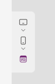
Microsoft have just introduced a new screen size selector when using the preview ‘play’ mode of your app whilst in the design mode of building a canvas app. This prevents the need to use the device screen size selector tool within the inspect part of your browser, and places this functionality directly in Power Apps, also making it stand out to makers unaware of the browser developer tools!
Changing your app authoring version
So, you might be wondering how you can get hands on with this latest functionality… the functionality is available in version 3.23053.23 in Power Apps. We’ll take a look at how to switch an app to use this version which will give us access to the new feature!
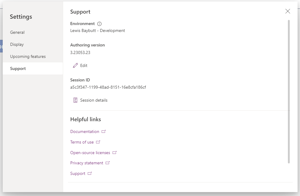
First open of your responsive designed apps in edit mode. Then select settings and tab to support.

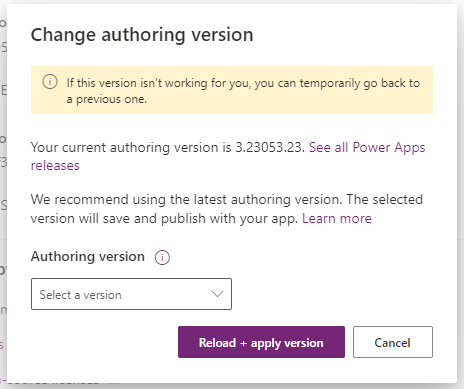
Next we’ll want to select that ‘Edit’ button under authoring version. In the dialogue appears select the auhoring version 3.23053.23 and select ‘Reload + apply version’.

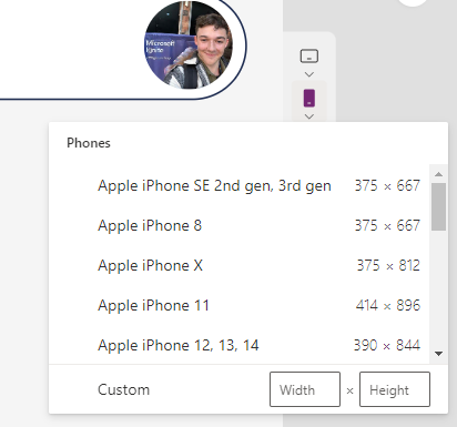
Following this, when you preview your app whilst in the design mode or ‘edit’ mode, you’ll see you’re now able to control the size of the canvas, matching common device screen sizes to test how your app will work with these devices. You can also use custom width and height inputs if there isn’t a device that suits your requirement.


