In today’s blog post, we’re going to take a look at the latest in UI for canvas apps from Microsoft. The new fluent UI controls have just made their way into public preview for us to check out in the canvas apps studio. In this post, I’ll show you how to get hands on with them and we’ll take a look at whats there for us to use! We’ll also discuss some of the current major limitations of these controls.
Enabling the new modern controls
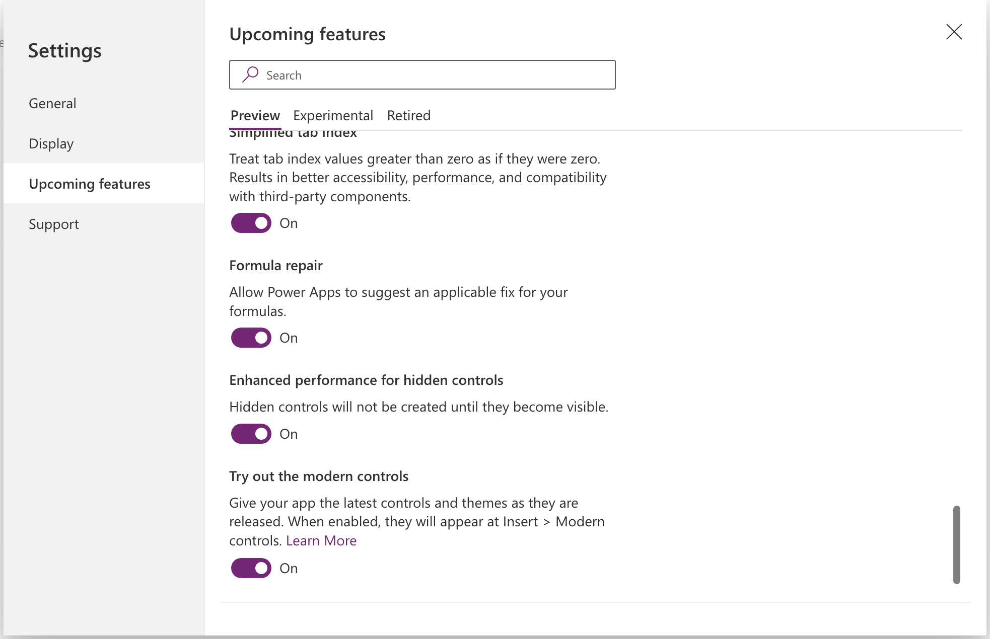
So to enable the new modern controls, from the canvas app studio we’ll need to head into settings, select ‘upcoming features’ in the left hand navigation, ensure we’ve selected the ‘Preview’ tab in upcoming features, and then turn on the option to try out the modern controls.

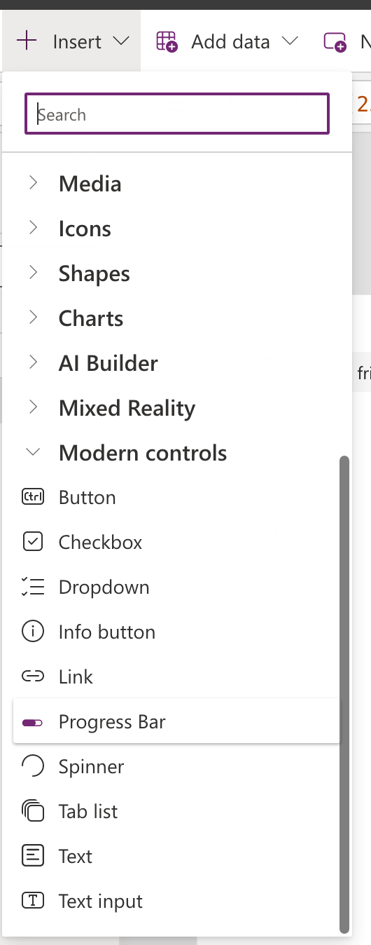
Now you’ll be able to find the new controls under ‘Insert’ then ‘Modern controls’.

A look at the new controls
So let’s take a look at what we’ve got here! We’ve got all sorts like buttons checkboxes and dropdowns which we’ve seen before with the classic controls.
We’ve also got some awesome new controls though that we haven’t seen out the box before including info buttons, links without having to use a HTML control, progress bars, spinners, and even tab lists!
I must say I love being able to use a spinner without having to create a component or import the ones from the creator kit or another component library.
Limitations
Now as much as some of the new controls which we haven’t seen out the box before are pretty cool and helpful, I must say there are currently some huge limitations of these new controls.
A main limitation to these controls currently is the inability to change colour options, as well as some other things i.e. different properties.
I will be interested to see how these things develop as this moves closer to general availability. But currently, I’m not sure I’ll look to use these in many of my apps just yet! That being said, I’m super excited to see where these controls go.

