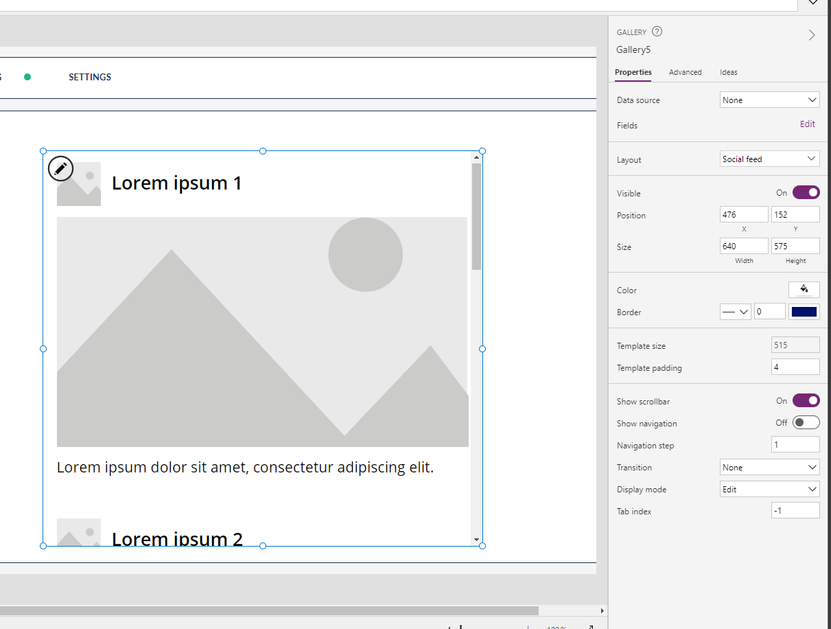
In this blog post focused slightly more on GUI in Power Apps, I’m going to take a look at flexible height galleries in Power Apps, which I used recently to solve a requirement I had when building a low code application in my solution.
We’ll look at the requirement I had, and we’ll then look at how flexible height galleries were a suitable tool to resolve my requirement, whilst also looking at how we use these!
If you like this type of content, make sure you subscribe to my blog to get my posts directly in your inbox on Low Code and Power Platform.
SubscribeA scenario
So lets look at a scenario, and an actual requirement I had to fulfil when building a canvas app for my solution. I had a case where I needed to provide users with a dynamic form in a sense, where a number of records in a questions response table had already been generated for those users. Then there was a property against each record determining the type of response a user had to give, then with two corresponding fields for each of those response types.
So my table schema in Dataverse looked a bit like this:
| Column Name | Column Type | Purpose |
| Question | Primary Name | To store the question to be displayed to the user in the gallery. |
| Response Type | Choice (Global Choice) (Choices: Detailed Response, Rating) | To conditionally display the correct type of input to the user in the flexible height gallery using the Visible property. |
| Detailed Response | Text area | To provide a store for a detailed response inputted to a multiline text input where this is visible due to the response type being set to Detailed Response. |
| Rating | Whole number | To provide a store for the rating inputted to a rating control where this is visible due to the response type being set to Rating. |
| Owner | Owner (polymorphic lookup field) | Out the box column to be set to the person who the question has to be answered by so they see their records only where security roles are also set for them to only be able to see their records. |
Table schema for question scenario i.e. survey / basic dynamic form
Hopefully this gives you a better idea of my scenario where I’m populating questions in a table and assigning them to respondees, where I’m also setting the response type and I want those questions to appear on a screen in a canvas app with the appropriate control to be able to patch that value back to the relevant column and record in the data source.
How do flexible height galleries help here?
So you might be wondering why I need to make use of flexible height galleries to solve this requirement…
Effectively, because of the different response types I have here, I need to use different controls for these. For example, I don’t want to give someone a text input for when I want them to provide a rating on something, I want to provide them with a rating control.
Now on the flip side, when I want a detailed response I want a much larger multiline text input control which is going to have a much greater height property than the rating. But the problem here, at least with a normal vertical gallery, is that I’ll need to increase my template size to fit this in, and then when the text input control isn’t visible but the rating one is for that type of question, I have a huge amount of white space. This is where the flexible height gallery comes in.
By using a flexible height gallery, each gallery item will adjust independently to the visible controls within that gallery item. So if I have one item which has a larger control visible, the gallery will make space for that, but if I have another item with a smaller control, the gallery will reduce that items height to not leave excessive white space.
Let’s take a look at how to use these!
Implementing a flexible height gallery
So now I’m going to take the scenario we discussed earlier and I’m going to use a flexible height gallery to achieve my requirement of displaying my questions and appropriate input for the response without leaving items with excessive white space on the screen.
I’ll start by adding a flexible height gallery to my screen and I’ll set the items property using my table name. I’ve added a filter on the owner here for cases where my user might be an admin and has security permissions to see more than just their own records, but on this view I just want them to see their own.

Now I’m going to remove the controls from this gallery except from the title text label which utilises the bolder font weight.
I’ll then set the items property of my gallery to the table which has my users question response records in it.
Items:
Filter('Onboarding Feedback Responses',Owner = gblUserRecord)gblUserRecord is a global variable I define during my app OnStart where it gets set to the current user’s User record in Dataverse using the following formula.
//Get current user dataverse record to use for assigning record to user
IfError(
    Set(
        gblUserRecord,
        LookUp(
            Users,
            'Primary Email' = gblLoggedOnUserEmail
        )
    ),
    Notify(
        "We weren't able to find a Dataverse user record for you. Some features in this application may not work. If the issue persists, contact your admin.",
        NotificationType.Error,
        10000
    )
);
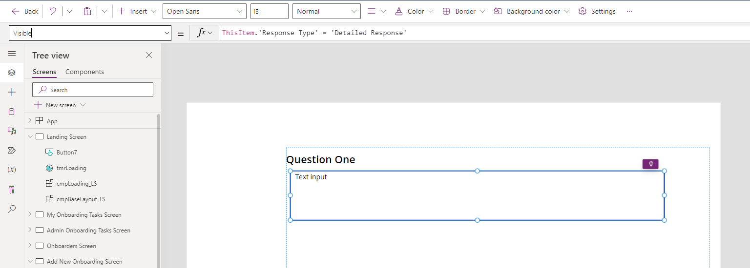
Now in my gallery I’m going to add the control for the first type of response I want to use which in my case is the detailed response type. I’m going to add a text input control for this, I’ll make it slightly bigger and set it to multiline. You can see that this is the control that will take up more space. Now I’m going to utilise my Response Type column in my schema to only make this control visible if the Response Type is Detailed Response.
I’ll set my visible property of my text input to the following.
ThisItem.'Response Type' = 'Question Type'.'Detailed Response'Here ‘Question Type’ is the name of my global choice.

Now this is staying visible because the first item in my gallery has its response type column set to detailed response. But I’ve noticed further items in my gallery, don’t have this input! They must be set to type rating!
Now I’m going to add a rating control right over the top of my text input control and set the visible property to…
ThisItem.'Response Type' = 'Question Type'.RatingNow, this has already disappeared in my first item because that one has the response type set to detailed response so I don’t result in having a true value passed back from my If() statement.
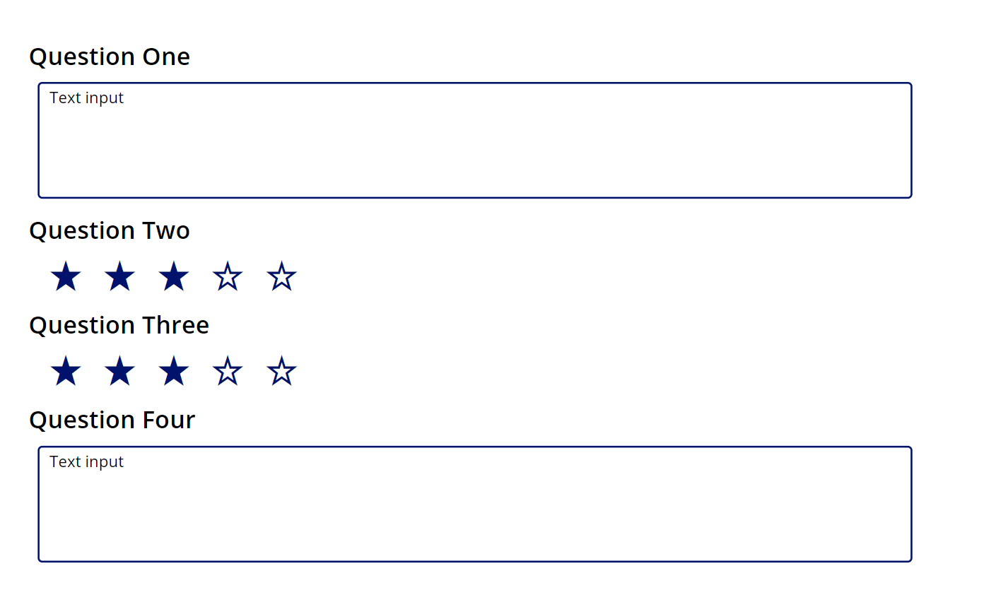
But if I take a look at my app in play mode and what my gallery behaves like, we’ll see that my gallery items height changes to hide the whitespace a normal gallery would create if I attempted to achieve this same design.

This now means that I can have smaller controls or detail in some gallery items and larger ones in others without creating whitespace where I use a hard coded template size with a normal vertical gallery!
I’d love to see your use cases for flexible height galleries! Comment down below if you’d like to share an example or if you didn’t understand something in this blog post. Make sure you subscribe to my blog in the footer of this page if you’d like to have my posts land in your inbox for all topics Power Platform and Low Code.

